
Graphing Tutorial
Step 1: Using SPSS
- Open your SPSS file.
- Click on Analyze.
- Click on Descriptive Statistics.
- Click on Frequencies.
- Highlight the three variables of interest (TV network, Weekday Bedtime, and Weekend Bedtime) and click the arrow (see below) to slide them across the dialog box.
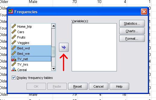
- Click OK.
- Save the ouput file onto your U drive, just to be safe. Note that there will be three tables in the output file - one for each of the variables of interest.
- Click on one of the tables and copy it (cntl-c).
- Open Excel and paste the table into Excel (cntl-v).
- Clean up the Excel file (e.g., make sure all of the bedtimes are listed in the format you want them to appear in).
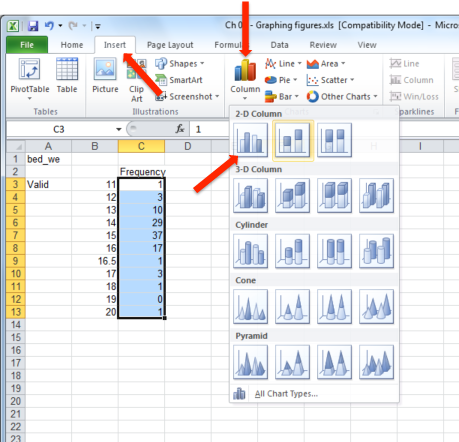
- Highlight the columns of data that hold the values for your x-axis. Then click Insert, then click Column, then click the first icon in the set labeled '2-D column'.
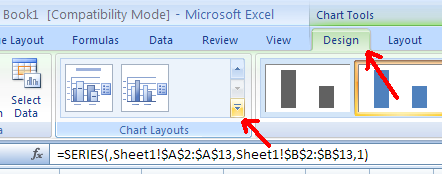
- Click on the graph you have just made. Then click on the Design tab. Then click Chart Layouts (note: be sure to click on the piece highlighted in gold in the figure below).
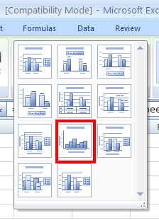
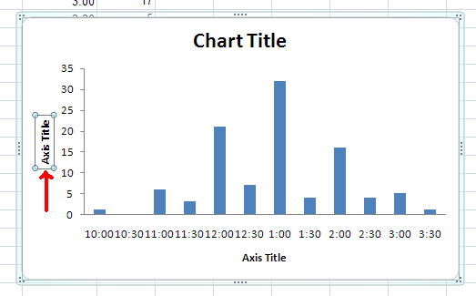
- Select the layout that you want from the list of choices. It's up to you to decide whether you want a title and legend, but your graph must have labels for both the x-axis and y-axis. The choice highlighted below would enable you to label both the x-axis and the y-axis. It would also allow you to create a chart title (but not a legend).
- After you have selected the layout you want, label y-axis by double-clicking on the 'axis title' label next to the y-axis. Type the appropriate label (e.g., Frequency), then hit return. Repeat this process for the x-axis label (and the title if relevant).
- Next you need to add the correct labels to your X-axis. To do that, right click the x-axis, then click on 'Select data'.
- Then click the 'Edit' button.

- Next, you need to highlight the labels for your x-axis. Notice that I have changed the labels from the odd 12-20 scale to represent the correct hours (12:00 PM - 8:00 AM).
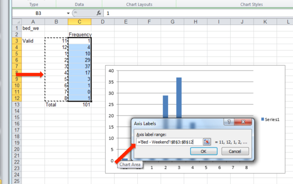
- Then click 'OK' and 'OK', again.
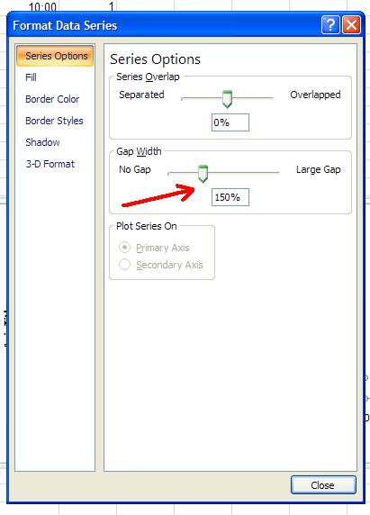
- If you are making a histogram, right click on the bars in the graph. Then click on 'Format Data Series'.
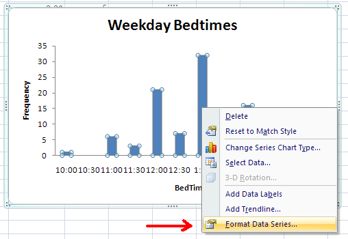
- Set the Gap width equal to 0 (you can do this by either typing a value in the space or using the slider).
- Click Close and you are done.